AI Autonomous Ridesharing Experience
OVERVIEW
What do you value most during your ridesharing experience?
The answers to these questions have been at the core of our team. Ridesharing isn’t just about getting from point A to point B; for us, it’s about redefining how we experience the journey itself.
During the intense 9 weeks of design work, we explored, improved, and developed this main idea into the final solution. Have you ever imagined a car that doesn’t just drive itself, but also
feels like a friend—someone who understands you, keeps you company, and even predicts your needs?
MY ROLE
UX Researcher
UX Designer
DURATION
2024.9 - 2024. 12
(9 weeks)
2024.9 - 2024. 12
(9 weeks)
TEAM
1 X Product Manager
1 X UX Researcher
2 X UX Designers
1 X Product Manager
1 X UX Researcher
2 X UX Designers
PRODUCT PREVIEW
Our team presents a user-focused and city-based AI system. Brooklyn,
our AI-powered assistant in NYC, whether you're exploring or commuting,
Brooklyn provides smart navigation, entertainment, and safety features for a smooth and enjoyable ride.
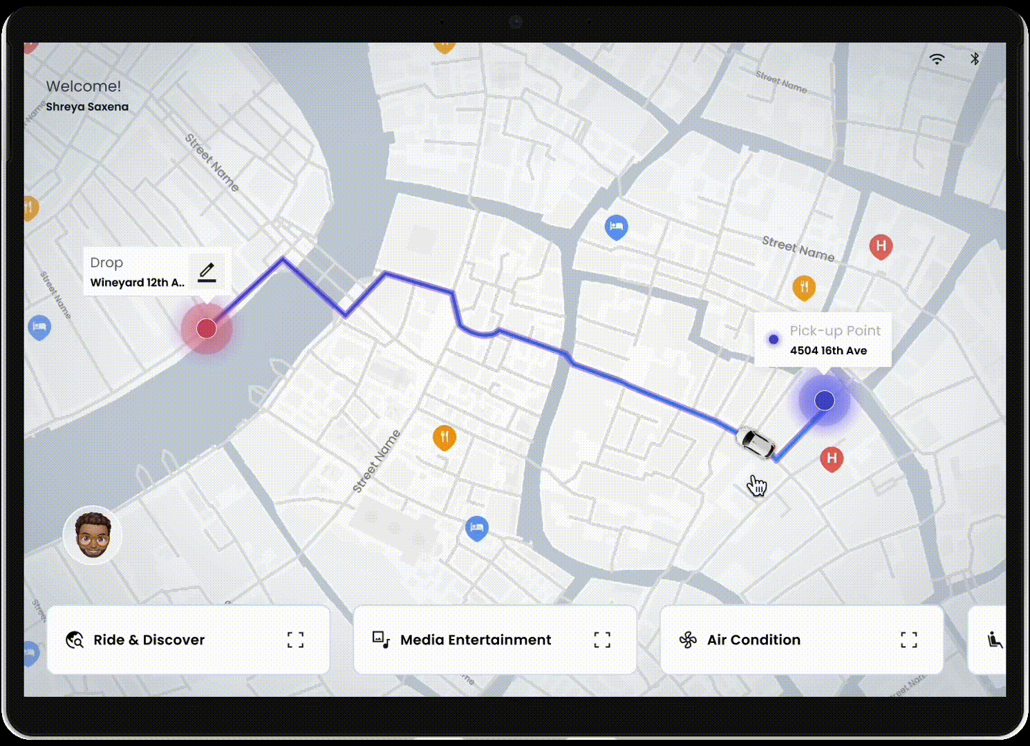
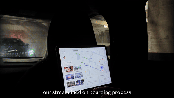
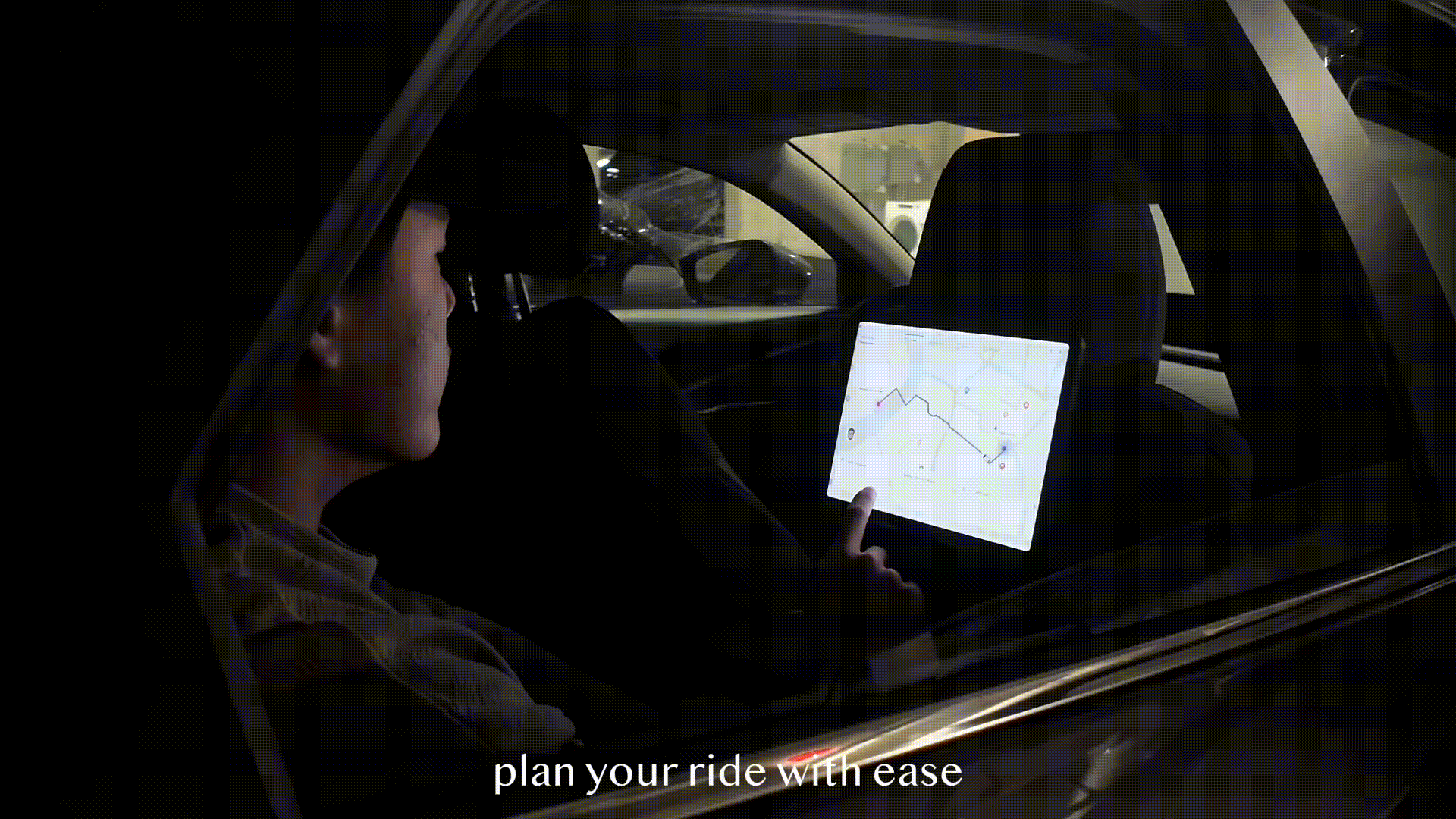
Start the ride with exploring different features on the in-car screen
Ride& explore: browse the city and add a stop at your interests
In car entertainments: play music, videos, karaoke or take a selfie
Switching different modes
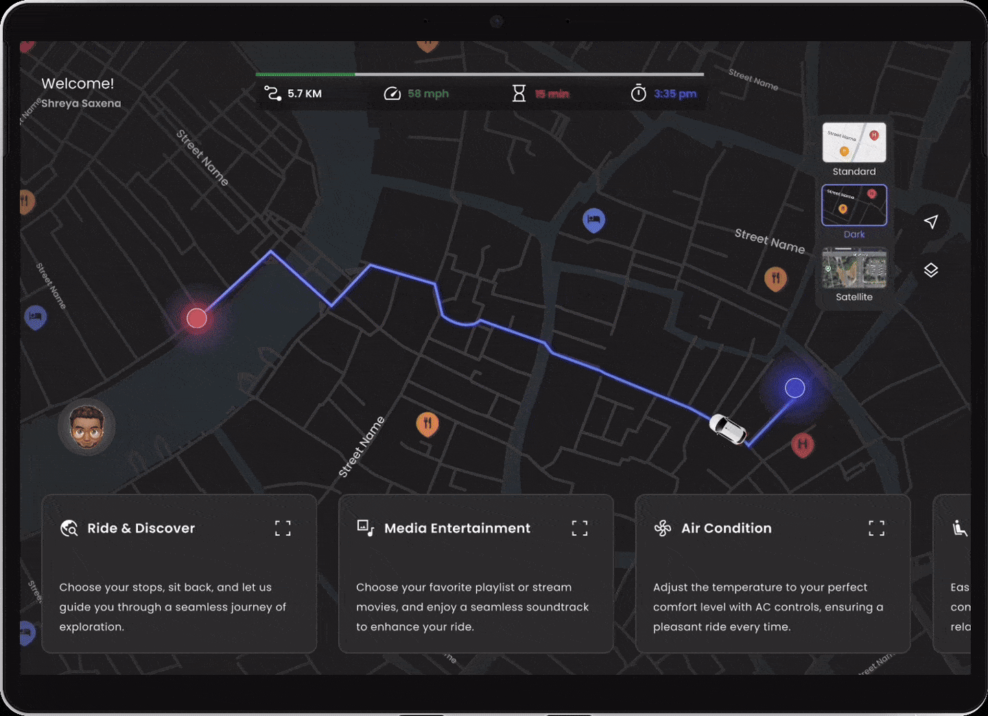
Safety drop off
VIDEO SHOWCASE
DESIGN SCOPE
By mapping the entire user journey—from ride request to trip completion—we discovered that existing apps heavily rely on drivers. In contrast, in systems like Waymo, it shifts the focus of "autonomy" to the boarding and driving processes. However, after in-depth market research, we found most of the autonomous ridesharing service, they did not explore much of in-car features and how can it impact the whole experience.
Based on the current market situation, we decided to explore the potential in in-car systems.
![]()
SURVEY
We first conducted an online survey, inviting 50+ riders to share their experience and expectations with ride-sharing.
![]()
When asked about riding with autonomous cars, 70% of participants expressed concerns on safety as well as how to interact with the car during the ride, however, 50% of them still wanna try the autonomous ridesharing service.
Therefore, after carefully analyze our potentiel users, we did not consider the safety as a main design problem, since we were designed for those who already willing to use the service, but not expanding the user group.
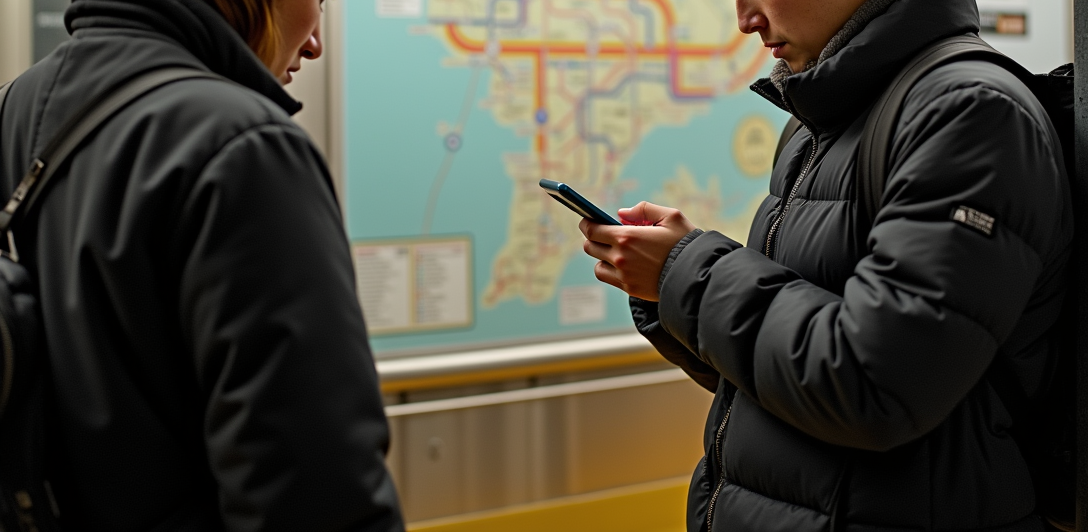
INTERVIEW
After the survey, we would like to delve deeper into the real-world scenarios of ride-sharing experience. Therefore, we conducted a 30 minutes interview sessions with 5+ participants.
![]()
During the interview process, we found that many potential users would choose ride-sharing services in unfamiliar places, concern about getting lost, language barriers, and complex transit systems.
TARGET USER
Based on the previous research findings, we decided to narrow our focus to the scenarios where people use ridesharing services: travel and business trips.
![]()
We set our persona as a female traveller who loves exploring different cultures, she likes relaxing and sceneviewing during the ride, and avoid language barrier with drivers to learn more local culture and history, and absolutely, she wanna save time and energy!
DESIGN QUESTION
These insights above led us to recognize the need for an innovative ride-sharing experience for self-driving technology. To refine our focus, we narrowed down our problem statement and came up with our design question:
How Might We Redeign a Smart and AI-assisted Ridesharing experience?
IDEATION
Through 2 weeks of design sprint, we decided to focus on user flow: in-vehicle features & seamless trip experience during the ride.
![]()
![]()
![]()
![]()
PROTOTYPE ITERATIONS
![]()
![]()
Onboarding Iteration: Initial prototype(top) vs Second prototype(bottom)
![]()
![]()
![]()
![]()
![]()
Entertainment Iteration: Second prototype(top) vs Third prototype(bottom)
During the usability testing sessions, we asked our participants to complete the tasks and try to find the goal of our product. The results indicated a strong interest in the entertainment features, with many participants eager to explore additional controls and content within the car. However, the current information hierachy is not clear and it is too overwhelmed for our users to explore. Therefore, we created a new information architecture and changed the visual layout.
![]()
![]()
At the same time, when we asked about the specific scenario of our participants when they tried the automous car, one thing they must do is take a selfie or videos. So, we add a selfie feature in the entertainment tab. We found instead of focus on safety issue, most of the participants are talking about emotional value. That makes us think more about what our partcipants really wanna do in the car. They wanna be “watched”!
![]()
We first decided to put the “Emergency Pull Over” button on the map view, which is the default screen. However, we found a lot of users would like to touch it to explore, and some of them even worried that “why you put the emergency button at here, is it mean the car is not safe?”. Therefore, we changed its location to be under the contact support, and according to the emergency level, place the four different functions.
![]()
FEATURE LIST
![]()
HI-FI PROTOTYPE
![]()
![]()
![]()
FINAL SCENARIO
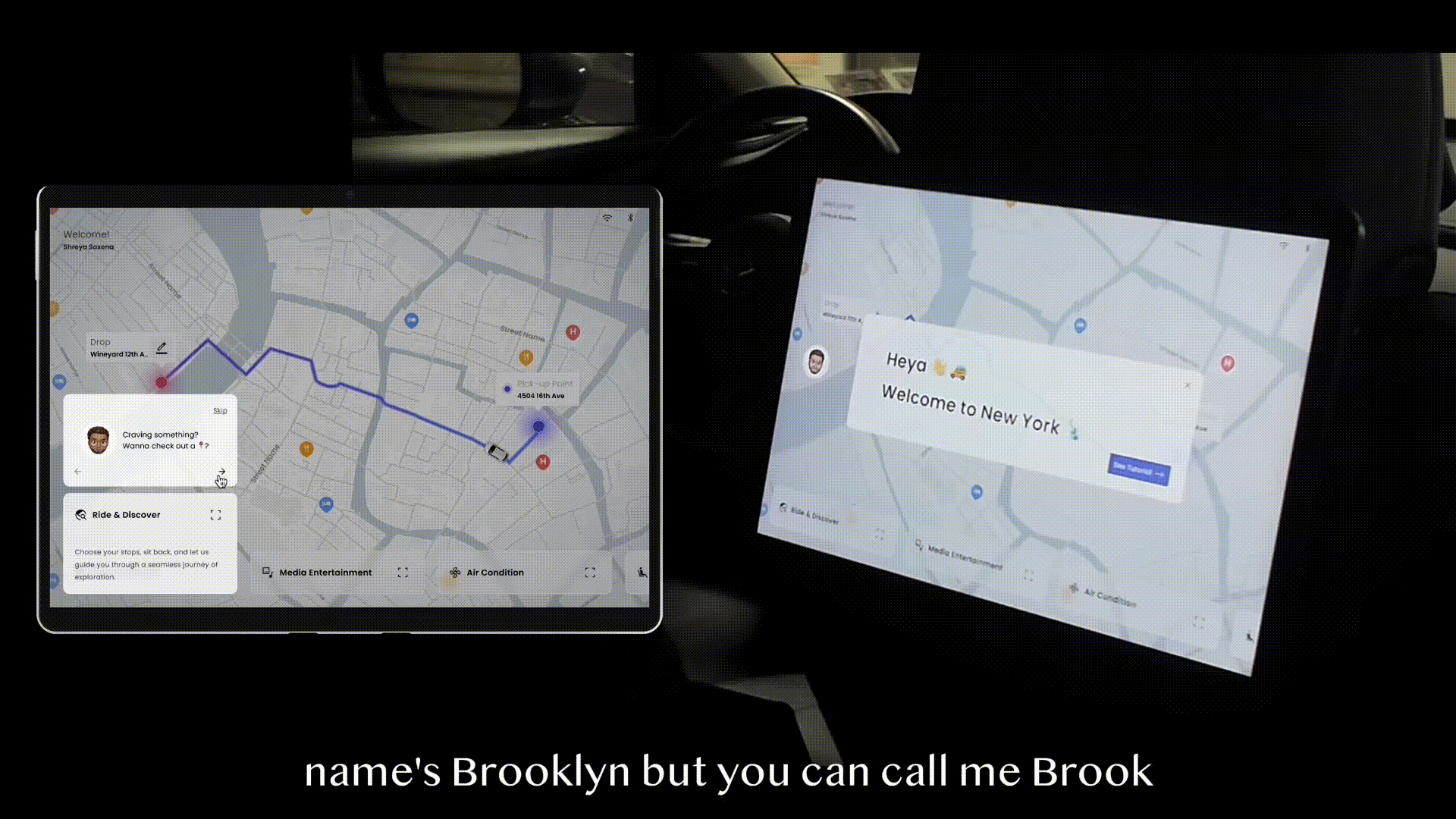
Scenario 01 Onboarding
This is Will's first time in New York. He had seen a poster about autonomous driving taxi before and decided to give it a try. After getting in the car, Brooklyn warmly welcomed him and introduced him to how to use the vehicle!
![]()
Scenario 02 Intuitive System
Will interested in the bottom bar, and began exploring the different functions.
![]()
Scenario 03 Ride&Explore
Will noticed the first function is called Ride&Explore, and he decided to explore some interesting spots and food in New York.
![]()
Scenario 04 Media Entertainment
When Will was driving through the NYC, he felt a little bit “ quite”, so he asked Brooklyn to play some music. The AI assistant, Brooklyn recomended Empire State of New York to him and switched the car to music mode, which allows him to immerse in the NYC style.
![]()
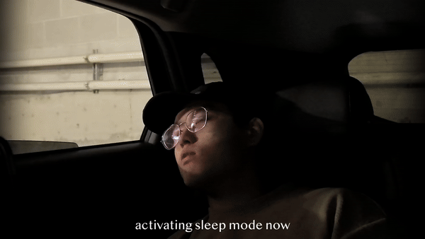
Scenario 05 Sleep Mode& Safety
The way to Times Sqaure is long, so Will decided to take a snap before arriving, Brooklyn helped him adjusting the light and strengthen the sound proof. When arriving the time-sqaure, Brooklyn woke up Will and noticed him to bring all the carry on and the surrounding is safe.
![]()
TAKEAWAYS
Research: Keeping Alignment Across the TeamThroughout the project, maintaining alignment among all team members is crucial.
Synthesize: Prioritizing Design OpportunitieIn group discussions, focus on selecting the most valuable opportunities by voting and refining research questions. It's important to ensure the team works toward a shared vision, optimizing the process of turning insights into actionable design directions.
Ideate: Embracing Diverse PerspectivesDuring brainstorming, it's essential to listen actively to each team member’s ideas, avoid unnecessary debates, and collaboratively explain and evaluate thoughts. This fosters creativity and ensures that all perspectives are considered while staying aligned with the design goals.
Prioritization: Knowing What (and What Not) to Focus OnIn time-constrained projects, distinguishing between essential and non-essential tasks is as important as defining the work itself.
DESIGN SCOPE
Design for the riders, not technology!
By mapping the entire user journey—from ride request to trip completion—we discovered that existing apps heavily rely on drivers. In contrast, in systems like Waymo, it shifts the focus of "autonomy" to the boarding and driving processes. However, after in-depth market research, we found most of the autonomous ridesharing service, they did not explore much of in-car features and how can it impact the whole experience.
Based on the current market situation, we decided to explore the potential in in-car systems.

User flow sketch
SURVEY
We first conducted an online survey, inviting 50+ riders to share their experience and expectations with ride-sharing.

When asked about riding with autonomous cars, 70% of participants expressed concerns on safety as well as how to interact with the car during the ride, however, 50% of them still wanna try the autonomous ridesharing service.
Therefore, after carefully analyze our potentiel users, we did not consider the safety as a main design problem, since we were designed for those who already willing to use the service, but not expanding the user group.
INTERVIEW
After the survey, we would like to delve deeper into the real-world scenarios of ride-sharing experience. Therefore, we conducted a 30 minutes interview sessions with 5+ participants.
During the interview process, we found that many potential users would choose ride-sharing services in unfamiliar places, concern about getting lost, language barriers, and complex transit systems.
TARGET USER
Based on the previous research findings, we decided to narrow our focus to the scenarios where people use ridesharing services: travel and business trips.

We set our persona as a female traveller who loves exploring different cultures, she likes relaxing and sceneviewing during the ride, and avoid language barrier with drivers to learn more local culture and history, and absolutely, she wanna save time and energy!
DESIGN QUESTION
These insights above led us to recognize the need for an innovative ride-sharing experience for self-driving technology. To refine our focus, we narrowed down our problem statement and came up with our design question:
How Might We Redeign a Smart and AI-assisted Ridesharing experience?
IDEATION
Through 2 weeks of design sprint, we decided to focus on user flow: in-vehicle features & seamless trip experience during the ride.

Initial brainstorming sketch
![]() Refined sketch
Refined sketch
 Refined sketch
We brainstormed different scenarios and stories, and iterated the potential solutions. Finally, we decided to focus on designing a car dashboard that users can interact with during their ride in the absence of a driver.
Based on that, we have defined 3 main flowcharts for the following prototyping.
Based on that, we have defined 3 main flowcharts for the following prototyping.


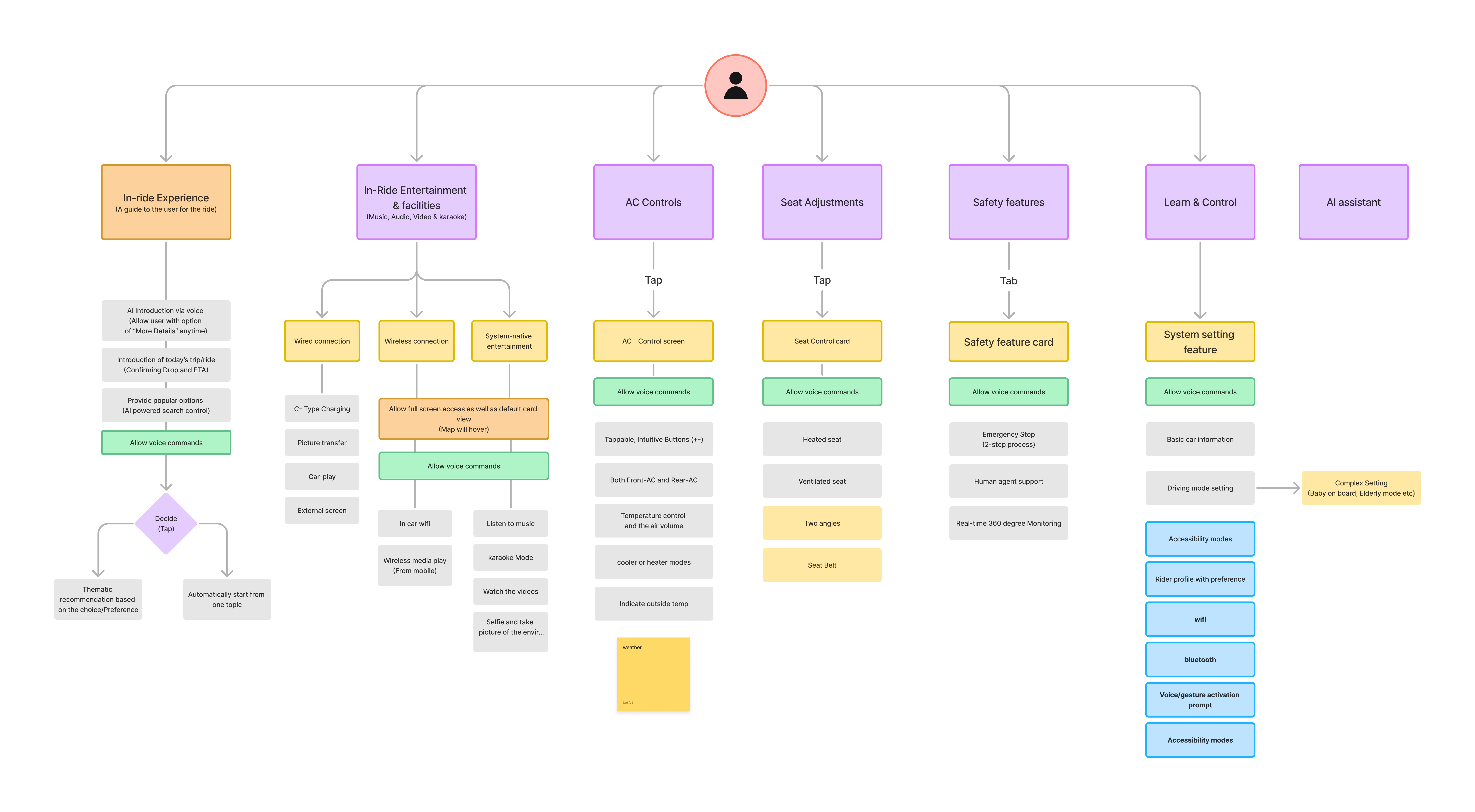
3 Flow charts
PROTOTYPE ITERATIONS

Design road map
In final 2 weeks, We prototyped 3 iterations and ran 3 rounds of usability testings, including 1 round of RITE.


Main Screen Iteration: Initial prototype(top) vs Second prototype(bottom)
During the first round usability testing, we invited our friends and peers, the most severe problem is the context, user cannot understand the feature’s function through the name(which we refer from Tesla), so we use simple name and add a secondary status that provides with more description to the feature. Users can easily tap to switch with different status, and we still keep the simplest one when the user first open the map view.

Final Feature Status

Map View Iteration: Initial prototype(left) vs Third prototype(right)
Instead of extra window to show the ride information, we integrate the route and all the other important information into the map, user can easily add a stop or check the car speed and the other information.

AI Assistant Iteration: Second prototype(left) vs Third prototype(right)
Initially, we put AI assistant as a pop-up icons, and then add it to the bottom feature. However, during the second usability testings, we found participants that it is hard to find the AI assistant when you need it, they’re more prefer one-tap or voice interaction. Therefore, we implemented the AI assistant as a permanent hovering button on the homepage, when it talks, the conversation frame will be expanded, user can easily choose to close or keep it.

Entertainment Iteration: Second prototype(top) vs Third prototype(bottom)
During the usability testing sessions, we asked our participants to complete the tasks and try to find the goal of our product. The results indicated a strong interest in the entertainment features, with many participants eager to explore additional controls and content within the car. However, the current information hierachy is not clear and it is too overwhelmed for our users to explore. Therefore, we created a new information architecture and changed the visual layout.


At the same time, when we asked about the specific scenario of our participants when they tried the automous car, one thing they must do is take a selfie or videos. So, we add a selfie feature in the entertainment tab. We found instead of focus on safety issue, most of the participants are talking about emotional value. That makes us think more about what our partcipants really wanna do in the car. They wanna be “watched”!

We first decided to put the “Emergency Pull Over” button on the map view, which is the default screen. However, we found a lot of users would like to touch it to explore, and some of them even worried that “why you put the emergency button at here, is it mean the car is not safe?”. Therefore, we changed its location to be under the contact support, and according to the emergency level, place the four different functions.

Information Architecture Sketch
In this stage, we further define our information system, what feature we should have, the feature name as well as what function should under each categories.FEATURE LIST

HI-FI PROTOTYPE

Ride & explore
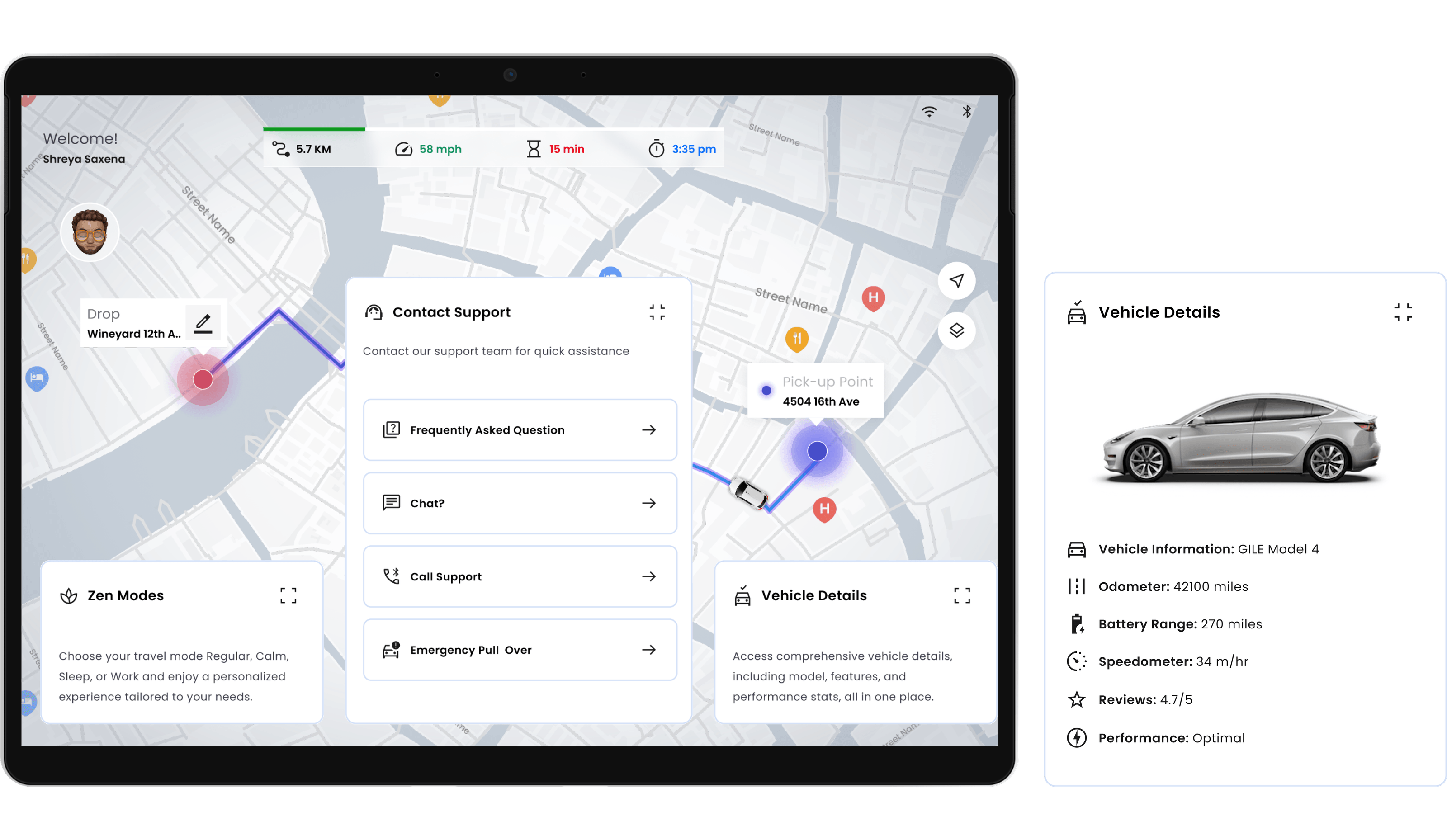
Contact support & vehicle details

Media entertainment
FINAL SCENARIO
Scenario 01 Onboarding
This is Will's first time in New York. He had seen a poster about autonomous driving taxi before and decided to give it a try. After getting in the car, Brooklyn warmly welcomed him and introduced him to how to use the vehicle!
Scenario 02 Intuitive System
Will interested in the bottom bar, and began exploring the different functions.
Scenario 03 Ride&Explore
Will noticed the first function is called Ride&Explore, and he decided to explore some interesting spots and food in New York.
Scenario 04 Media Entertainment
When Will was driving through the NYC, he felt a little bit “ quite”, so he asked Brooklyn to play some music. The AI assistant, Brooklyn recomended Empire State of New York to him and switched the car to music mode, which allows him to immerse in the NYC style.

Scenario 05 Sleep Mode& Safety
The way to Times Sqaure is long, so Will decided to take a snap before arriving, Brooklyn helped him adjusting the light and strengthen the sound proof. When arriving the time-sqaure, Brooklyn woke up Will and noticed him to bring all the carry on and the surrounding is safe.
TAKEAWAYS
Research: Keeping Alignment Across the TeamThroughout the project, maintaining alignment among all team members is crucial.
Synthesize: Prioritizing Design OpportunitieIn group discussions, focus on selecting the most valuable opportunities by voting and refining research questions. It's important to ensure the team works toward a shared vision, optimizing the process of turning insights into actionable design directions.
Ideate: Embracing Diverse PerspectivesDuring brainstorming, it's essential to listen actively to each team member’s ideas, avoid unnecessary debates, and collaboratively explain and evaluate thoughts. This fosters creativity and ensures that all perspectives are considered while staying aligned with the design goals.
Prioritization: Knowing What (and What Not) to Focus OnIn time-constrained projects, distinguishing between essential and non-essential tasks is as important as defining the work itself.